
Apartments 247 Corporate Site
Live site
Programs
Adobe XD
Adobe Illustrator
Adobe Photoshop
My Role
Web Designer - 33%
Graphic Designer - 50%
Copy Editor
Timeline
December 2023 - January 2024
TLDR
In just 45 days, I helped redesign Apartments247’s corporate website to reflect its evolution into a full-service digital marketing provider for the multifamily industry. Working on a small design team, I contributed to 30% of the site pages, created 50% of the graphics, and ensured accessibility and quality during development. Our goal was to increase visibility of underutilized products, improve user engagement, and highlight our brand’s creative and technical strengths. The result was a cleaner, more strategic site that led to a 22% increase in product sales, a 5% reduction in bounce rate, and stronger customer understanding, all delivered on time and aligned with our broader marketing push.
Overview
Redesign of Apartment 247's corporate site to better reflect brand positioning and improve visual storytelling.
My role
During the month of December my role was to collaborate with a small team and deliver stunning pages and graphics, which ended up being 30% of the sites pages, 50% of the graphics, and edit the copy handed down from the Vice President. I was to oversee any changes to the site the developer made to ensure accessibility and quality were adhered to.
Business Goals
Over the past 25 years, Apartments247 has evolved from a pioneering web design firm into a comprehensive digital marketing powerhouse for the multifamily housing industry. Initially focused on creating stylish, SEO-optimized websites, the company has expanded its offerings to include professional photography, interactive 3D floor plans, AI-driven leasing chatbots, and robust search engine marketing services. This growth reflects their commitment to innovation and meeting the dynamic needs of property management companies nationwide. To effectively showcase their broadened suite of services and reaffirm their position as industry leaders, Apartments247 recognized the need for a website redesign. The new website not only highlights their expanded capabilities but also embodies their forward thinking approach, ensuring clients can easily access the tools and information necessary to enhance their online presence and attract more leads and leases.
Business goal:
Increase sales of other products by 20%
Reduce bounce rate by 5%
Display the potential of our full team and product line
Make products clear, visible, and appealing to the multifamily industry
Who are the Users?
The users we are designing for are primarily property managers, marketing teams for apartment complexes and property owners. Apartments247 is a BtoB company that offers marketing tools and services for the multifamily housing industry.
Constraints
Time: We have 45 days to launch the new site to coincide with our other marketing material being completed by other teams.
Design: The skeleton of our site design will stem from a theme previously built for customers but for times sake we are adapting it to fit the needs of our corp site. This limits our freedom slightly but has many advantages.
Process
Kickoff
We met as a team with our VP several times to discuss the brand vision and business needs before getting started. We had to decide what was going to make the most impact on the site and designate our resources accordingly.
Audit
We broke down and reorganized the structure of the site based on Apartment247’s new and expanded product line, aligning with their business needs. We removed, combined, and added pages where necessary. A pain point in the previous site was that all the service pages CTA linked to other services, making the menu underutilized while the redesigned site map has some pages in the same category linked via CTA but mostly pointing to our contact page or features.
Competitive Analysis
Competitors lead with scale and system depth. We lead with design and outstanding personal service. Apartments247 is the choice for operators who want visual storytelling, conversion-driven UX, control over their digital brand, and instant human help. Our redesign aimed to showcase that unique value—balancing technical capability with the creative freedom that sets us apart.
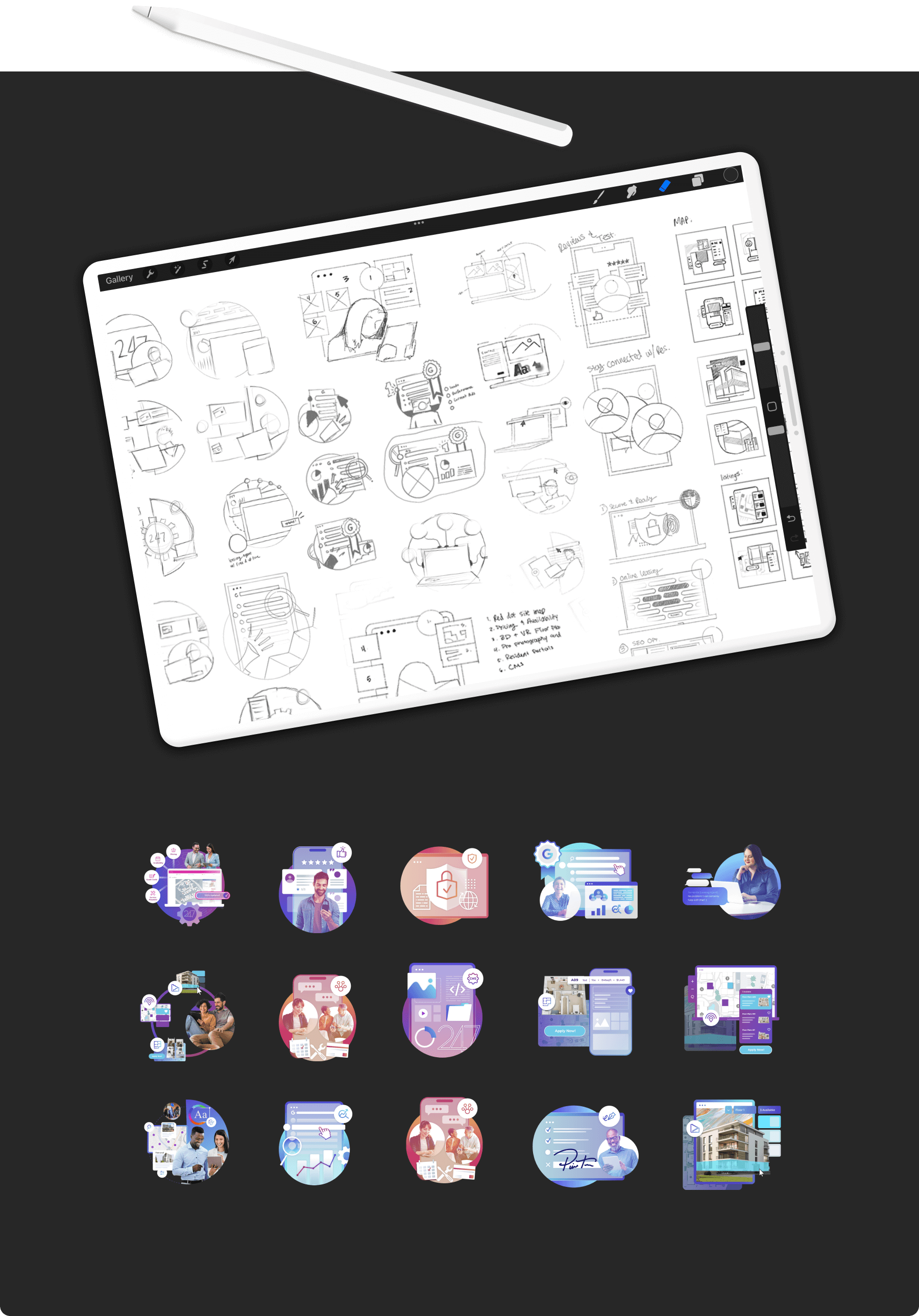
Wireframes
We began with a prebuilt theme designed by Robert as a foundation, allowing for an efficient system to be developed from that layout. From there, we adapted the framework to better align with user needs—focusing solely on layout and navigation at this stage. Several elements from the original Essence theme, like the dot-based nav, menu bar, footer imagery, and content structure, didn’t suit our goals. We also determined that distinct hero sections would help users recognize page changes without overcomplicating the layout. This alone saved many days of work between team members.
I had agency over several pages where I needed to display the product through clear language and descriptive visuals that showed the complex process behind the scenes without overwhelming the user. Each page needed to be as scannable as possible, so shorter pages with emphasis on quick information was my goal. Once the content was sorted out I could start on the wireframes.
I was responsible for these pages…
Affordable
Community
Integration
Lisa
Multi-level site map
The design stems from the principle of space, letting areas breath and giving focus to the bold headlines and imagery. The sections of bold gradient colors reinforce the Apartments247 brand and are valuable in bringing attention to certain areas, playing into the scanability of the site.
Graphics
After first brainstorming with Robert, We developed a layered, dimensional graphic style that combines minimalism with bold gradients to visually communicate the complexity of our service suite in a simple, engaging way.
Our inspiration
We pulled ideas from Adobe, DuckDuckGo, and Paypal. Their ability to explain products through a mural of ideas, symbols and imagery inspired us to give more visual flair to our designs. For larger graphics I adopted the central image of a user and created a story around them, showing a condensed user path with icons and floating cards. Smaller graphics emphasized playfulness with proportionally larger elements to describe the product.
Handover
Graphics: We decided on animating the elements in a sequence, so when it loads the elements appear to layer on top of each other. That posed a lengthier handover process as each piece needed labeling in a diagram. However, this proved to to be very beneficial as our animations changed over time making for more flexible revisions.
Mockups & Prototype: XD was our program of choice so sending a dev link with all information was a short task. We ensured during the prototype phase that our structure was tight and followed the approved system rules from page to page. This eliminated any development confusion and limited questions.
Feedback
The site was well received on the first delivery. As I mentioned, there was enough input from stakeholders during the process that the end result may only have technical findings rather than visual. They guided our team using information from the sales and marketing team who identified customer trends on the backend so good news from the initial launch was expected.
Launch
Through the dedication, careful planning, and execution from our team we were able to complete this redesign within the timeframe of 45 days, staying on track with our wider rollout. After launch, engagement with previously underperforming services like the “Integration” and “Lisa” product pages increased by 22% within 90 days, attributed to improved clarity and new visual storytelling on those pages. Over that same period our bounce rate was reduced by 5% and the sales team reported higher knowledge of our offerings from customers ultimately reducing time on phone calls and trainings.

In Hindsight…
This project reinforced the importance of cross-functional collaboration. In future iterations, I’d like to implement a scalable design system and a centralized design handbook to streamline handoffs. The success metrics and positive stakeholder feedback affirmed the impact of our user-centered approach. Since the design team didn't get direct access to the metrics we were reliant on stakeholder feedback in which our testing was limited. Despite this our goals were accomplished and have only received the best praise for our work.